Building a company
from zero.
In 2009, I joined Inflection as one of its first design hires to help build Archives.com, a family history search engine aimed at making genealogy research affordable and accessible. At the time, the market was dominated by Ancestry.com, which was expensive and complex. The opportunity was to serve the same deep human need at a fraction of the cost and friction.
I worked directly with the founders, co-creating the product strategy and design system from scratch. The team was small — eventually growing to six people spanning UX and front-end development, including engineers based in Ukraine who I worked with closely for years across time zones and cultures.
"User feedback quickly revealed a desire for more than just a search engine — people wanted an affordable, comprehensive family history experience."
We listened. Over three years we grew Archives from a search engine into a full family history platform: historical records, image viewer, family tree, alert system, and more. The result was the #2 player in the family history market in under 3 years — built by a team that could fit in a conference room.
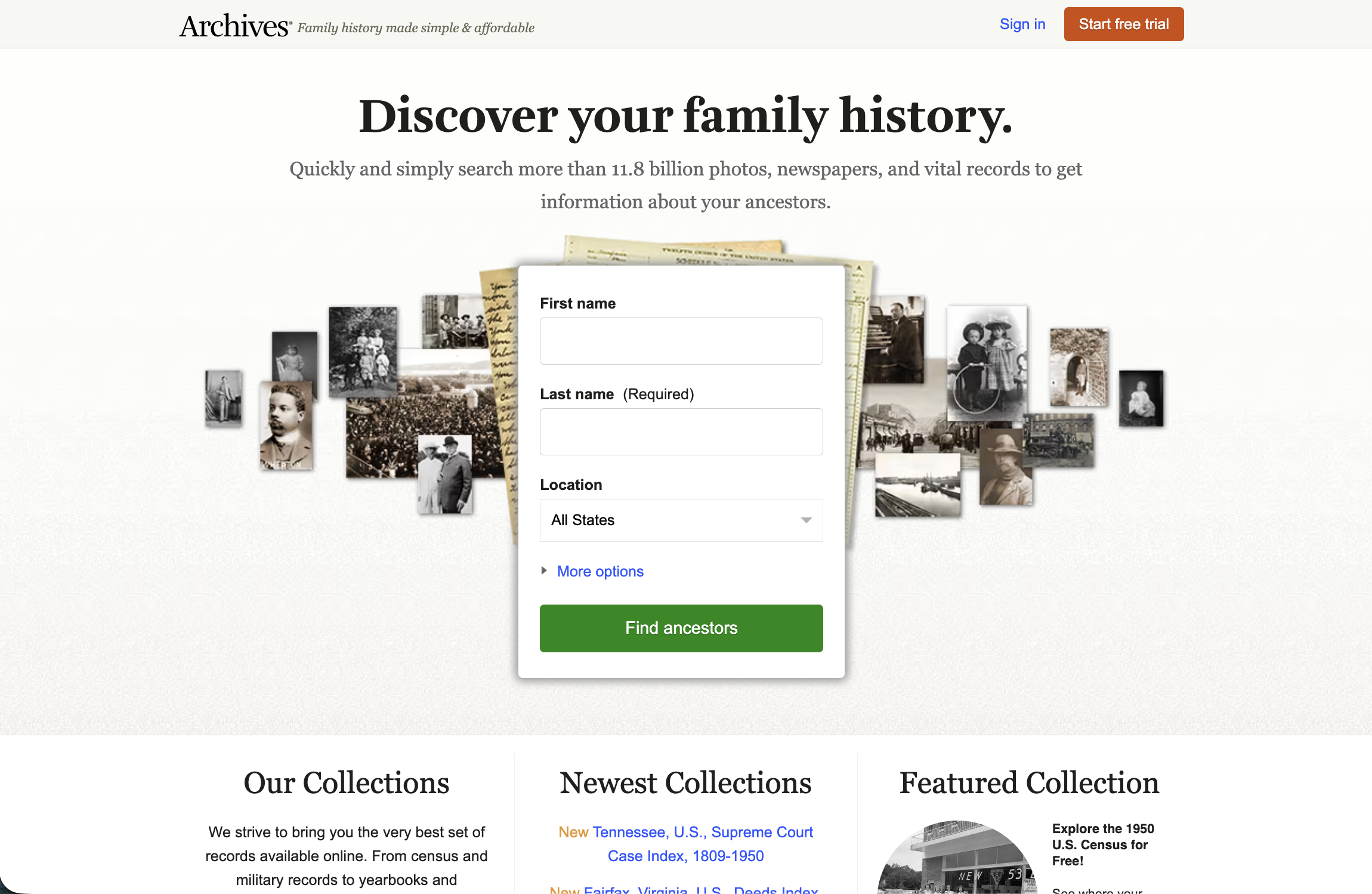
Archives.com homepage — the signed-out experience that served as the top of every new user's funnel. Simple, direct, and built around a single job: find your ancestors.
Archives.com launches at Inflection
Co-designed with founders. Affordable family history search engine targeting a market owned by expensive incumbents.
Platform expansion
Added family tree, image viewer, record-saving, and alert system. 100+ A/B tests across conversion, engagement, and retention. Grew to 500K subscribers.
$100M acquisition by Ancestry
Inflection acquired after 2.5 years. Team moved to Ancestry's San Francisco office. Missions aligned — practices needed harmonizing.
Scalable redesign
Led 4–6 month redesign sprint: responsive, global, modern frontend, and usability fixes — all in one effort. Launched in 4 countries.
6 years of design leadership complete
Left with a product fully rebuilt for scale, an international user base, and a design system the front-end team had helped build from scratch.
A search engine that became
a platform.
Archives.com started as a historical records search engine. Over time, user research made clear that search was just the entry point. What people actually wanted was to build and understand their family story. We evolved the product to meet that need across three core experiences.
Search & discovery
The core, a powerful search engine enabling users to search across record types, filter by time period and geography, save records to folders, and associate findings with their family tree. Speed and precision were the bar. For genealogy researchers, a single record can unlock years of unknown family history, the search had to be worthy of that moment.
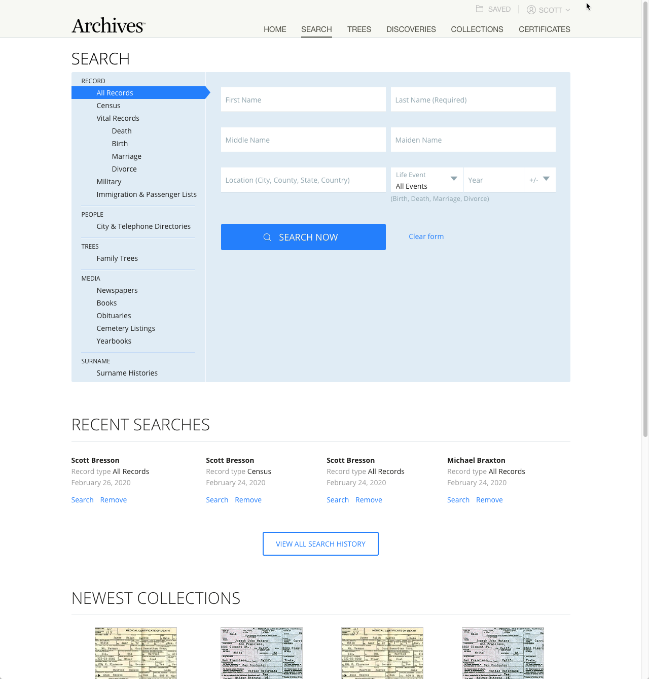
Archives.com search — category filtering across record types, recent searches, and newest collections. Speed and precision were the bar for a user base where a single record can unlock years of research.
Image viewer
Accessing historical documents is the "holy grail" for genealogy researchers — it's the moment a name in a record becomes a real person. We built a responsive image viewer that let users zoom, pan, and annotate original scanned documents: census records, ship manifests, draft registrations. The experience had to respect the gravity of what people were looking at.
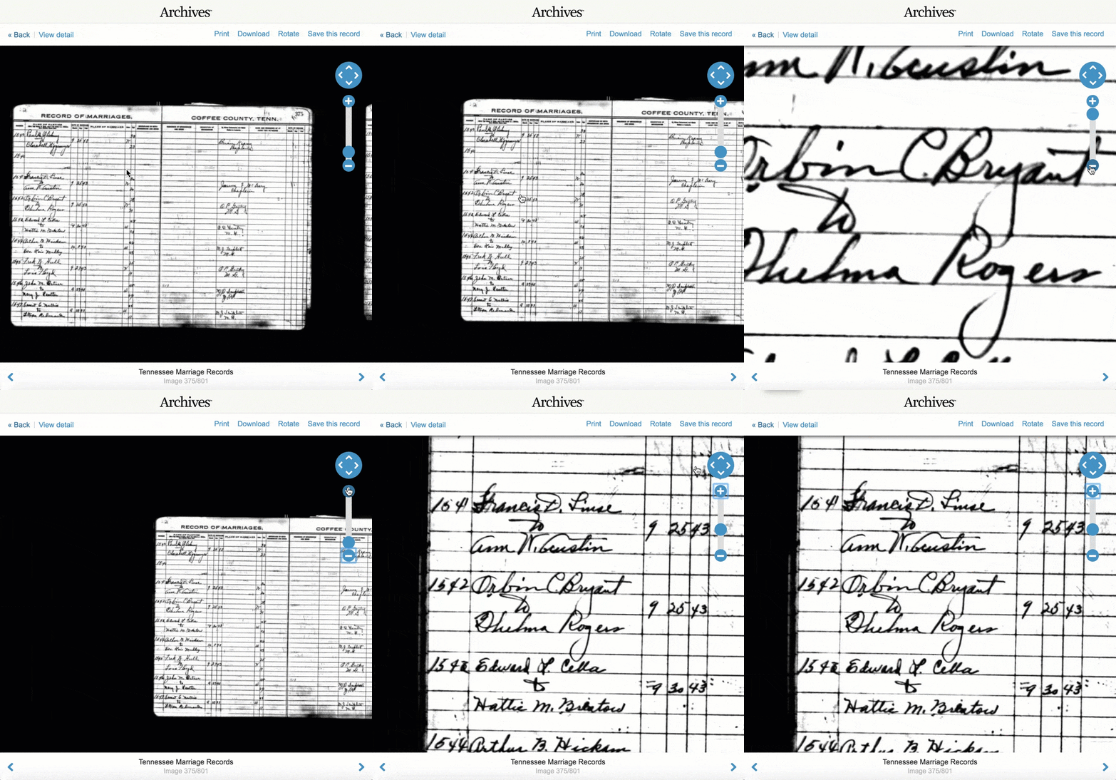
Image viewer — Tennessee Marriage Records, 1893. Zoom, rotate, download, and save controls built around the gravity of the moment: for many users, this is the first time they've seen their ancestor's name in an original document.
Vibe-coded recreation
View prototypeFamily tree
In 2011, we overhauled the family tree entirely — adding zoom, expandable nodes, two viewing modes, and direct connection between tree nodes and found records. The challenge was balancing information density with emotional resonance: a family tree is both a data structure and a story.
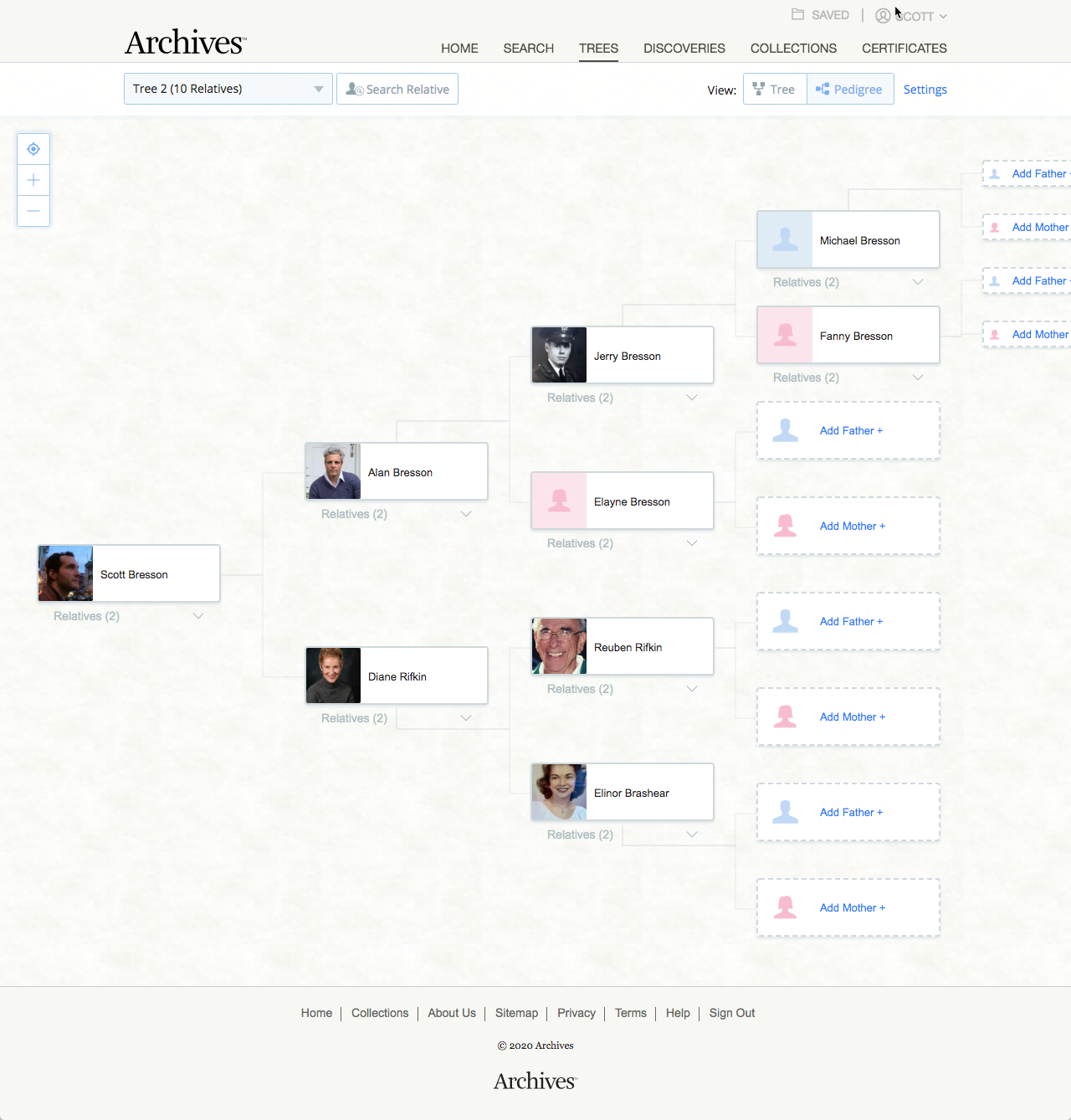
Family tree — rebuilt in 2011 with expandable nodes, profile photos, and two view modes. Each node links directly to that person's historical records found in the archive.
100+ tests.
Three questions.
Growth at Archives wasn't accidental; it was structured. We ran over 100 A/B tests across all our properties, organized around three questions that drove every experiment.
Conversion
How many people are signing up? Every free-to-paid moment was tested — messaging, timing, friction, flow.
Engagement
How rich is their usage? We tracked depth of search, records saved, and tree activity as proxies for meaningful engagement.
Retention
At what rate are they staying? Genealogy research is long-term, the best retention signal was return visit rate, not session length.
The alert system was one of our most effective retention tools — notifying users when new records matching their family tree were added to the database. It turned a passive subscriber into an active one without any UI friction: the product went out and found new value, then brought the user back to see it. No prompt, no re-engagement campaign — just a personalised email with a direct link to a record that mattered to them.
Four problems.
One sprint.
By 2014, Archives.com faced four concurrent pressures that had each been building independently. Leadership recognised that tackling them separately would be slower and more expensive than a single coordinated effort. I made the case for consolidating everything into one 4–6 month redesign sprint.
Getting leadership buy-in
The work didn't start with design — it started with a pitch. I advocated for treating these four pressures as one design-led initiative rather than four separate engineering tickets. That required framing the opportunity clearly: a 4–6 month investment to unlock global markets, fix years of accumulated friction, and future-proof the codebase.
Once approved, I ran quarterly planning, sprint planning, and daily standups to keep the work visible and moving. Each designer owned a designated section of the site; the image viewer and family tree received minimal revisions after recent redesigns, so the team could focus on the areas that needed the most work.
Design system — built alongside the product
Rather than building the design system as a prerequisite, we built it in parallel. UX and front-end met weekly — identifying components, dividing the design work, and always including developers in reviews to collaborate on motion, interaction states, and component behaviour. It was a genuinely collaborative artefact, not a handoff document.
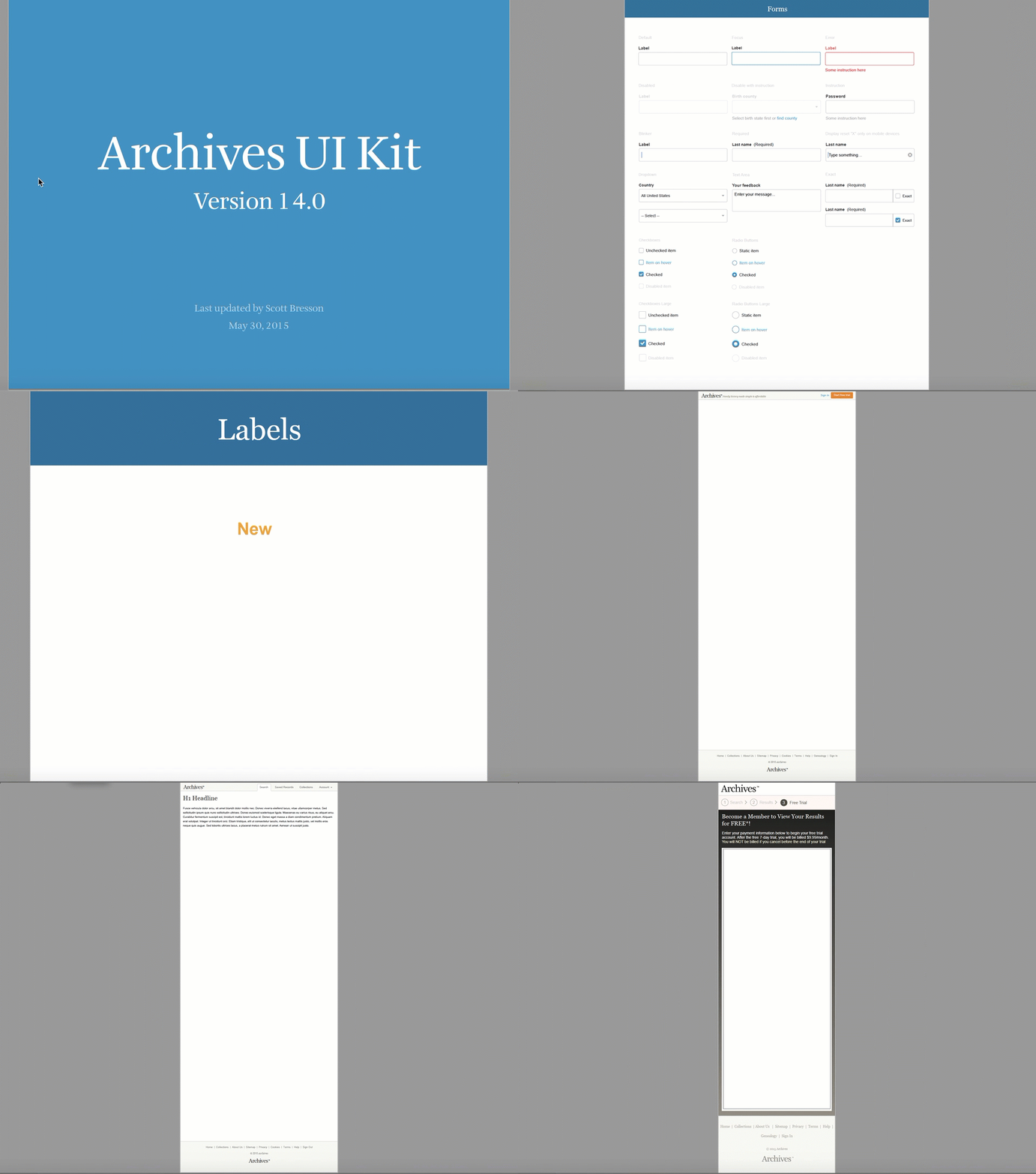
Archives UI Kit v14.0 — reaching version 14 reflects how the system was built: iteratively, collaboratively, alongside the product. Not a one-time deliverable.
Rollout strategy
We didn't flip a switch. The new experience rolled out gradually — new users saw it by default; existing users could opt in. This let us monitor metrics, catch regressions, and build confidence before full cutover. It also meant the team was shipping and learning in parallel rather than waiting for a big-bang launch.
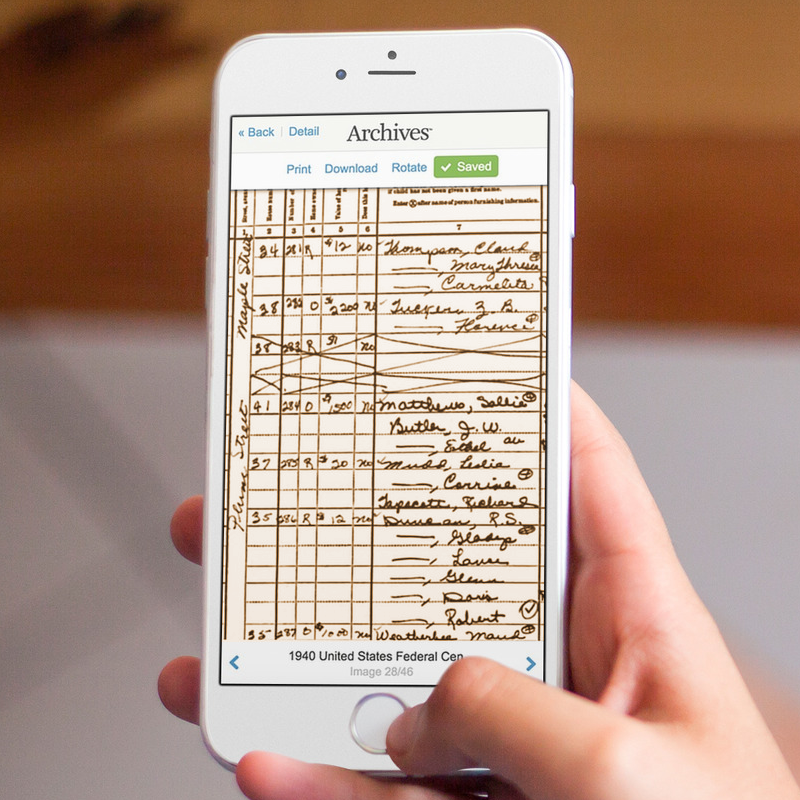
Mobile — the image viewer on device. +15% mobile traffic post-launch.
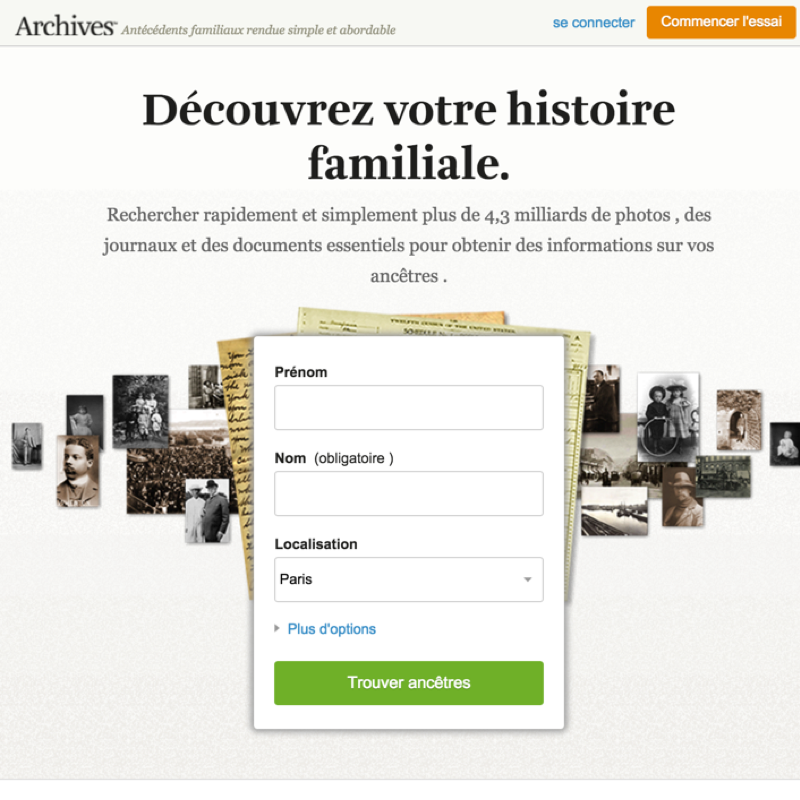
International — French market launch. Same system, different language and locale.
Responsive redesign launched across 4 countries — the same codebase supporting mobile, international, and future market expansion without a per-market redesign.
Building and leading
the team.
Across six years and two companies, I built and led a mixed team of product designers and front-end developers, a model that kept design and engineering in constant dialogue rather than sequential handoff. At peak, the team was six people; it included designers and engineers based in Ukraine who I worked with closely for years.
At a glance
Founding design voice. At Inflection, I worked directly with the founders to define the product direction, the IA, and the visual language of Archives from day one. There was no design precedent to follow, every decision was made from user research and competitive analysis.
Research as a team practice. With a lean team covering significant surface area, research had to be efficient and multi-modal. We ran in-home observations, website surveys, usability tests, and affinity mapping sessions, and translated findings directly into persona frameworks shared across product and engineering. Early ideation ran from pencil to paper before anything reached Sketch, keeping the team's thinking divergent when it needed to be.
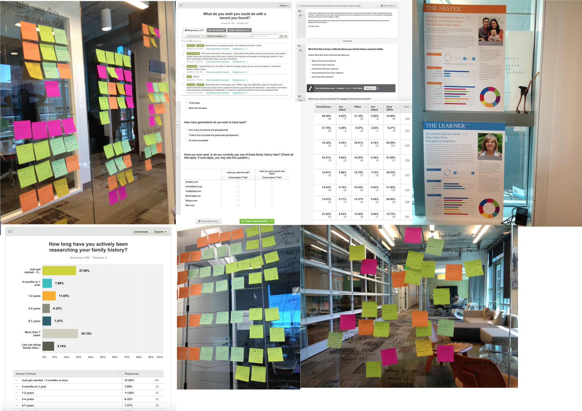
Research toolkit — affinity mapping, surveys, personas, and facilitated team sessions
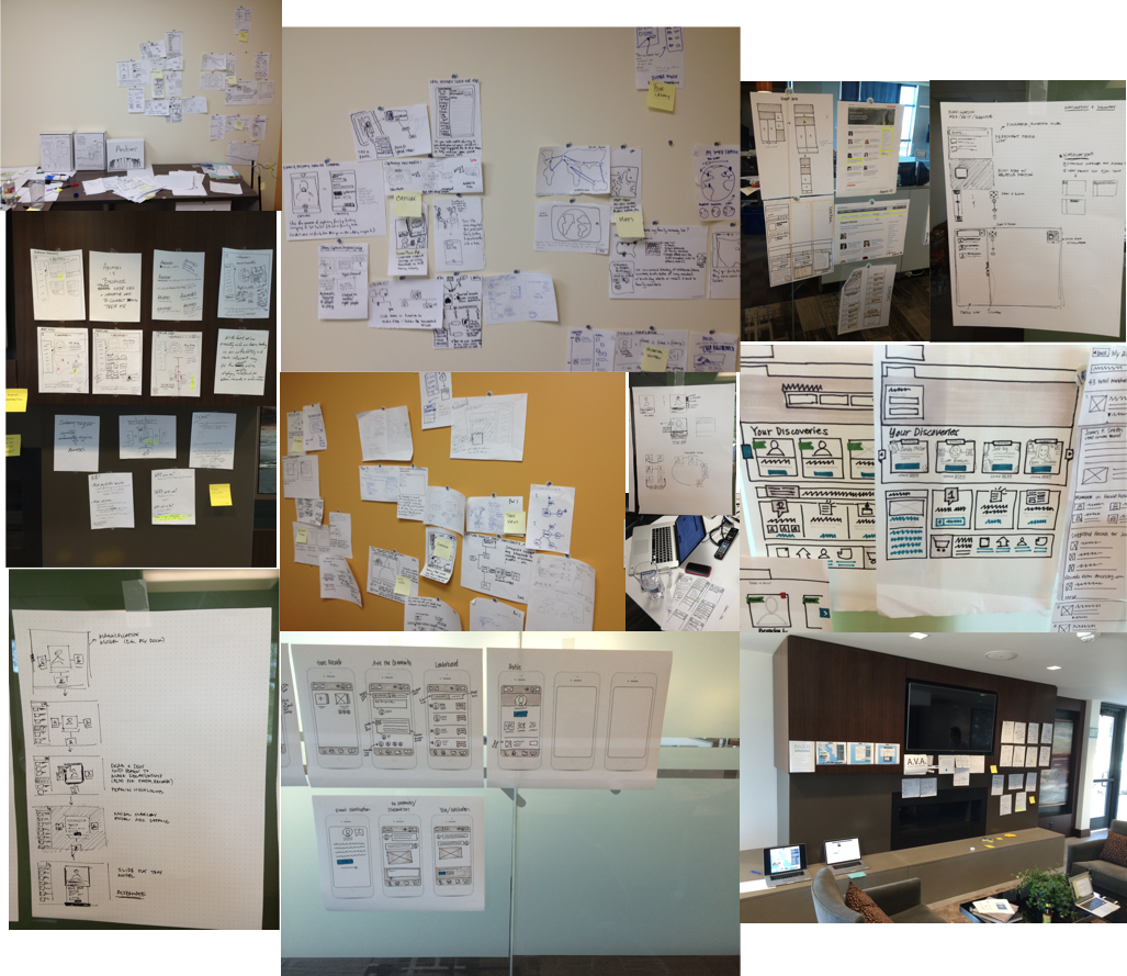
Early ideation — pencil to paper before anything reached a digital tool
Building across time zones. Working with engineers in Ukraine required discipline around documentation, async communication, and trust-building. The design system was as much a communication tool as a craft artefact — precise enough that implementation decisions could be made confidently without a real-time review.
Post-acquisition integration. When Ancestry acquired Inflection, I had to navigate the transition of a small, fast-moving startup team into a larger org with established processes. I worked to preserve what had made the team effective — high design–engineering collaboration, fast iteration — while adapting to Ancestry's scale and structure.
Capacity and resource planning. As Sr. UX Manager, I owned the resourcing model for the team — balancing sprint work, system work, and exploratory research across a lean team with significant surface area to cover.
Six years.
Compounding returns.
The results of six years of consistent design leadership and execution compounded across two distinct phases, the startup build and the post-acquisition scale.
The arc
Built from zero to 500K subscribers and $30M ARR in 3.5 years. Reached #2 in the family history market. Acquired for $100M.
Responsive redesign + design system + international launch unlocked ~$7M in new revenue. Launched in 4 countries. +15% mobile traffic post-redesign.
The biggest design returns came from treating infrastructure (design system, responsive architecture) as a product investment — not a cleanup project.
Market position
Reached #2 in the family history market within 3 years, competing against a dominant incumbent with a fraction of the resources.
A/B tests shipped
Growth through structured experimentation across conversion, engagement, and retention — not guesswork.
Mobile traffic increase
Post-redesign mobile traffic growth, reflecting a user base that had been underserved by the desktop-only experience.
Countries at launch
International launch in 4 countries, with the system designed to scale to additional markets and languages without redesign.
What I'd do
differently.
Six years on one product gives you a long view, including a clear picture of where early decisions compounded well and where they accumulated into debt.
The design system should have come first.
We built the design system alongside the 2014 redesign — which worked, but only because we had enough momentum and trust to do it under pressure. Building it three years earlier would have made every product decision faster, every A/B test easier to ship, and the acquisition handoff cleaner. The lesson: treat system investment as a growth lever, not a housekeeping task.
Distributed collaboration takes explicit architecture. Working with engineers in Ukraine for years taught me that effective cross-timezone teams don't happen organically — they require deliberate investment in async documentation, shared vocabulary, and trust built through consistent follow-through. The design system served this function for craft decisions; we could have built the equivalent for product strategy decisions earlier.
Mobile should have been a constraint from day one. We treated mobile as a future consideration when we launched in 2009. By 2014, it had become the forcing function for an entire site redesign. In hindsight, responsive-first architecture from launch would have saved the 2014 sprint entirely, or at least compressed it significantly.